
#futureofdigital
Or Warm. Or Custom. Let our developers create your RGB or Hex based from the Gather+Design+Develop.

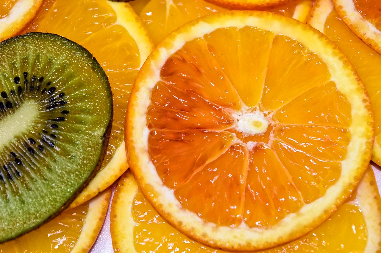
The color of joy, sunshine, and the tropics it represents enthusiasm, fascination, happiness, creativity, determination, attraction, success, encouragement, and stimulation. It combines the energy of red and the happiness of yellow in a non-aggressive relationship. To the human eye, orange is a very hot color, so it gives the sensation of heat. Orange increases oxygen supply to the brain, produces an invigorating effect, and stimulates mental activity. It is highly accepted among young people. As a citrus color, it is associated with healthy food and stimulates appetite. Orange is the color of fall and harvest. In heraldry, orange is symbolic of strength and endurance. Orange is the color of social communication and optimism. From a negative color meaning it is also a sign of pessimism and superficiality. Orange has very high visibility, so you can use it to catch attention and highlight the most important elements of your design and is very effective for promoting food products and toys.
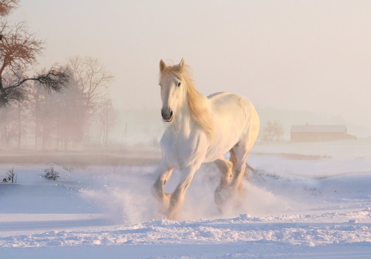
The color meaning of white is innocence, wholeness and completion with its association of light, goodness, innocence, and virginity. It is considered to be the color of perfection and its positive connotation depicts a successful beginning. In heraldry, white depicts faith and purity. In advertising, white is associated with coolness and cleanliness because it's the color of snow. You can use white to suggest simplicity in high-tech products. White is often associated with low weight, low-fat food, and dairy products. White is associated with hospitals, doctors, nurses, and sterility, so you can use white to suggest safety when promoting medical products. White reflects light. Brides wear white to symbolize innocence and purity; Angels are usually imagined wearing white clothes. White is an appropriate color for charitable organizations; popular in decorating and in fashion because it is light, neutral, most complete and pure, the color of perfection.

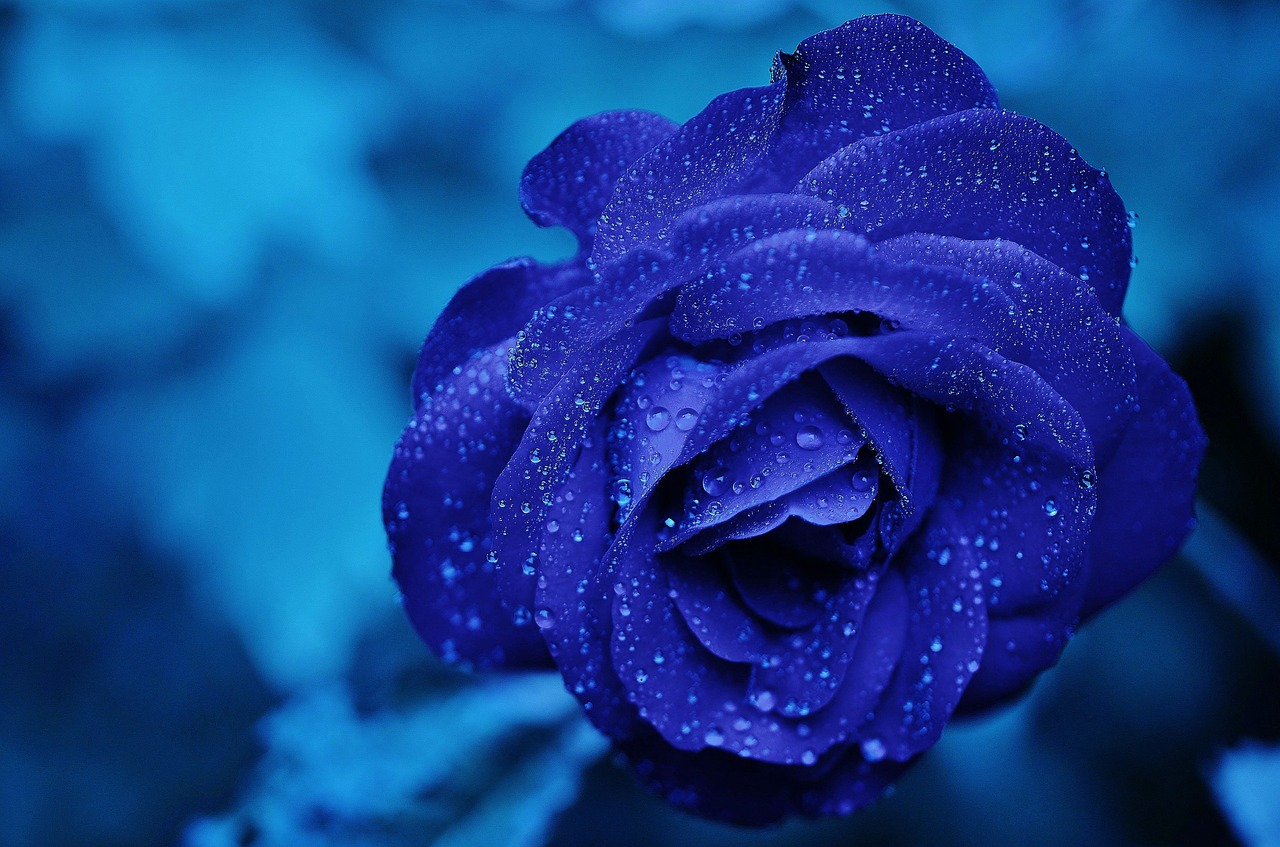
In its meaning can bring idealism and structure, ritualistic and addictive effects even though it is also cold and can be depressing. The color is considered beneficial to the mind and body associated with tranquility as its nature causes the body to produce calming chemicals. In heraldry, blue is used to symbolize piety and sincerity. Blue is the color of trust and peace and can suggest loyalty, integrity, conservatism, and frigidity. You can use it to promote products and services related to cleanliness (water purification filters, cleaning liquids, vodka), air and sky (airlines, airports, air conditioners), water and sea (sea voyages, mineral water). Use blue to suggest precision when promoting high-tech products as it is linked to consciousness and intellect. Avoid using blue when promoting food and cooking, because blue suppresses appetite. Blue is a masculine color and weightlifters are able to handle heavier weights in blue gyms. Fashion consultants recommend wearing blue to job interviews because it symbolizes loyalty and is a preferred color for corporate America as dark blue is associated with depth, expertise, and stability. People are more productive in blue rooms as it symbolizes wisdom, confidence, intelligence, faith, truth, and heaven. Blue food is rare in nature. While blue is one of the most popular colors it is one of the least appetizing. Food researchers say that when humans searched for food, they learned to avoid toxic or spoiled objects, which were often blue, black, or purple.

The color brown is a friendly yet serious, down-to-earth color that relates to security, protection, comfort and material wealth. Solid, reliable brown is the color of earth and is abundant in nature with a slight sadness and wistful. Green, brown, and red are the most popular food colors. Brown suggests stability and denotes masculine qualities. Men are more apt to say brown is one of their favorite colors. Brown is friendly and welcoming. It is loyal, trustworthy and reliable, in a practical and realistic way. In color psychology the color brown is referred to as honest, genuine and sincere. It refers to the hard-working, diligent and reliable, with both feet planted firmly on the ground. Brown is sensual, sensitive and warm, and gives one a sense of calmness and comfort. It is a practical and sensible color, indicating common sense. The color brown is associated with healthy, natural and organic products, and everything related to the outdoors.


From a color psychology perspective, the color is a compromise – it is either black or white. It is the transition between the 2 colors. The closer the gray comes to black, the more dramatic and mysterious it becomes. The gray color meaning is more luminous and vivid, the closer it comes to silver or white.
It is subdued, quiet and reserved, not particularly energetic or exciting. In the world of colors, gray is conservative, boring, sad and depressing on one hand, but elegant and formal on the other hand. It is unemotional and detached and can be indecisive. In Corporate America employees wear gray suits, which are conservative, reliable and consciously formal.
To build better, we partner with headlining developers that have unlimited ideas to offer you, our clients, inspiration.


Digital production specializing in creating web and app interfaces. It starts with a Discovery Call, then together we will complete the BRE Method to launch!
#futureofdigital